iMapBuilder - Interactive Map Software
![]()
![]()
Help Topics:
Getting Started
- Installation guide
- Interface Introduction
- Create an interactive map
- Map properties
- Styles and color theme
- Tooltip
Draw on map
- Add marker
- Draw line
- Draw route
- Add label
- Add clickable area
- Insert image or add logo
- Edit multiple objects
Software Features
- Area color and link settings
- Create heat map
- Map with legend
- Category filter for markers
- Highlight and group areas
- Import city to an interactive map
- Pan and zoom function
- Default zoom level and center point
- Batch edit region settings
Publish to the web
Embed map into blog or CMS
Plot latitude and longitude
Example of use
- Create population density heat map
- Clickable image map
- Create a drill down map
- Create World map
- Create U.S. map
License and registration
Data visualization heat map
Interactive population density heat map gives users an overview about population density in different parts of the world or within a country. With the help of heat map, users can understand more about the population distribution.
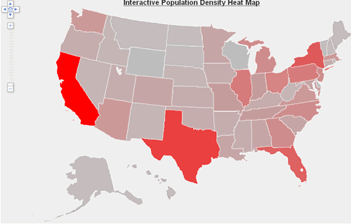
Here is an example interactive population map of United States, the region with the
largest population (i.e., California) is displayed in red and Wyoming
with the lowest population shows grey, while those in between are
shown with colors that lie in between the two extreme colors. Place a
mouseover on the WA, CA, CO, PA or NY for details.
- Click heat map settings tab and check enable heat map function checkbox.
Choose the colors for highlight, start and end of gradient.

- Click fill heat map data button.

- Add population in Heat Value column, and don't modify the ID
and Region Name columns.
You can import your data from an Excel Unicode text file (.txt) by pressing import from Excel or click paste all from clipboard button to paste the data from clipboard. You can also export the data to Excel by pressing export to Excel for calculations in Excel Spreadsheet.
Click verify data to verify if the numbers are valid integer values.

- Click apply to save the settings, then the heat map will show up. You can see
different levels of color gradient in different regions. As we use
red to represent maximum value and grey to represent low value.